Icon Stacking on Blueprints
When creating custom Blueprint screens for eKeypad, a very powerful feature is available called the “Icon Stacking Level”. This article explains how this feature works and give some examples of how it can be used.
The icon stacking feature allows you to define how overlapping icons should be displayed. With stacking, you can define an icon to always be above or below other icons on the screen. Without stacking levels, the appearance of overlapping icons can not be controlled.
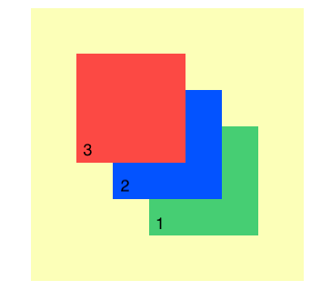
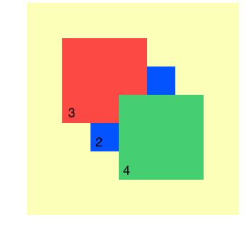
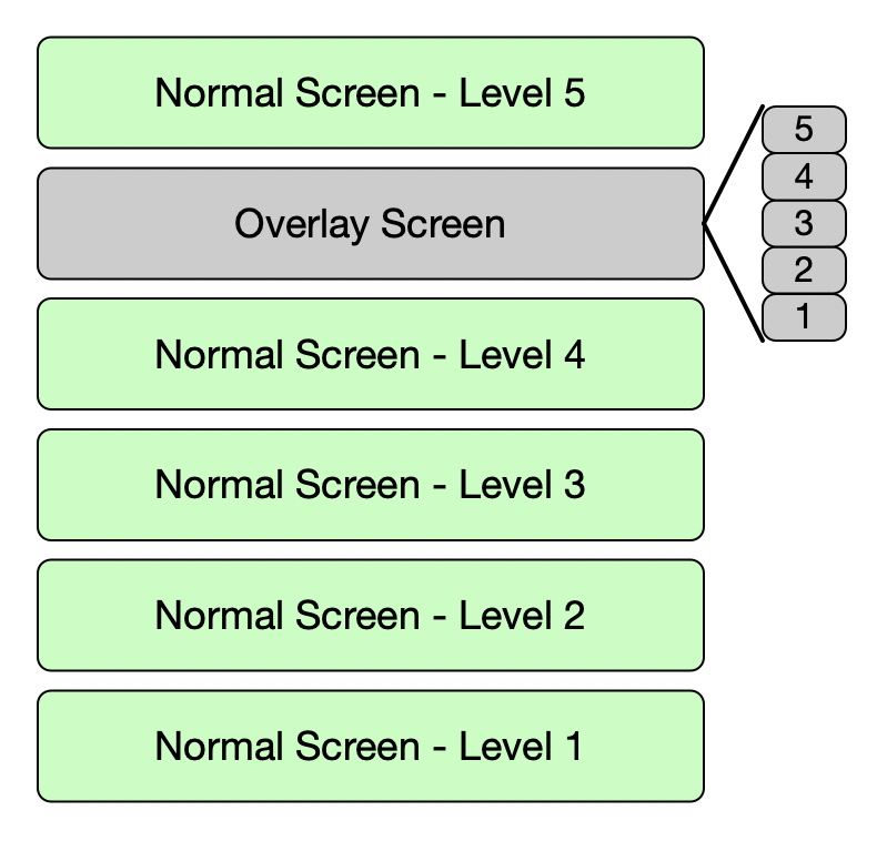
There are 5 icon stacking levels numbered 1 through 5. Icons with higher stacking levels will always display above icons with lower stacking levels. The images below demonstrates the the visual change that occurs when changing the stacking level of the Green box from a value of 1 to a value of 4.
Changing the Stacking Level
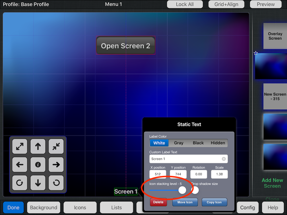
The stacking level setting is accessed from the icon detail window. To display this popup window, start by selecting an icon while in the Blueprint is in editing mode. You will know that you have the icon selected when the border outlining the icon turns from Blue to Green. If the border around the icon is Red, this indicates the icon is locked and must be unlocked before it can be selected.
Once the icon is selected, a double tap on the icon, or pressing the information button in the floating toolbar to open the details screen for the icon in a popup window. The stacking level slider is located on this popup screen.
Using the Stacking Level
At a basic level, the stacking level allows you to ensure that overlapping icons are always displayed the way you want. However, this functionality can be used in several advanced ways to enable useful usability and navigation functionality.
Stacking Level 5
It is important to know that stacking level 5 has a special behavior.
First, some context is necessary. Blueprint interfaces are made up of one or more normal screens plus a special overlay screen. The distinction between these screen types is that only one normal screen can be visible at a time while the overlay screen is always visible and displayed on top of the normal screen. This structure with the overlay screen on top can cause unwanted overlapping or obscuring of icons on the normal screen. The special behavior of stacking level 5 is used to addresses this issue and enable more advanced interfaces.
This special behavior applied to icons set to stacking level of 5 will cause any icons on a normal screen to be displayed above the overlay screen.
Icons set to stacking level 5 on the overlay screen have no special behavior.
There are a large number of ways stacking levels can be used to improve the usability or functionality of Blueprint screens. A few examples are listed below:
- Increasing the touchable target size of icons
- Adding control to non-controllable elements
- Advanced menu and navigation functionality
Larger Touch Target
Creating a larger touch target area for icons can make significantly improve the usability of Blueprint screens. The accuracy of users tapping icons falls dramatically when the target area is smaller than a 3/4in or 20mm square. If spreading icons across multiple Blueprint screens is not possible, then using the larger touch target can be helpful.
In general, the technique is to use a status only icon on a lower stacking level and a larger, hidden control icon on a higher stacking level just above the status icon.
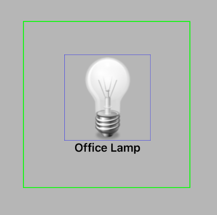
The image to the right demonstrates this technique. The office lamp icon with the blue border is a simple status only icon with no control abilities. The larger icon with the green border is a control icon for the office lamp that is setup with a hidden icon and a hidden name label.
When using this setup, touches anywhere within the green box will control the office lamp.
Control Static Elements
No all elements on a Blueprint screen are icons. Static images, and the background image can contain navigation elements. Using a hidden icon allows interactivity to be added to these elements.
In the image below, the floorpan of the house is a simple background image added to the Blueprint screen. The icon with the green border is a hidden icon that links to a different screen representing the second floor of the home.
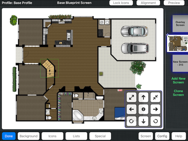
When not in editing mode, the icon will have no visual appearance but tapping on the stairs will transition to the upstair screen.
Menus and Navigation
One of the primary purposes of the overlay screen is to make it easier to create menus or navigation elements that are visible on all Blueprint screens. However, one of the challenges designing an overlay screen is the fact that the overlay screen is displayed on top of the normal screen.
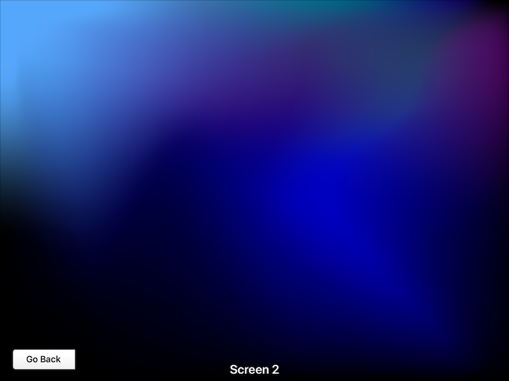
The stacking levels, specifically level 5, is very useful in achieving a more useful and feature rich interface. Because icons in level 5 are displayed above the overlay it can be used to add screen specific items to the overlay elements. In the example screen below, you can see a blank screen with only a background image and a navigation bar along the bottom that is on the overlay.
Our goal in this example is to build a navigation system between two similar screens. The image below demonstrates how we want our final screens to look and behave.
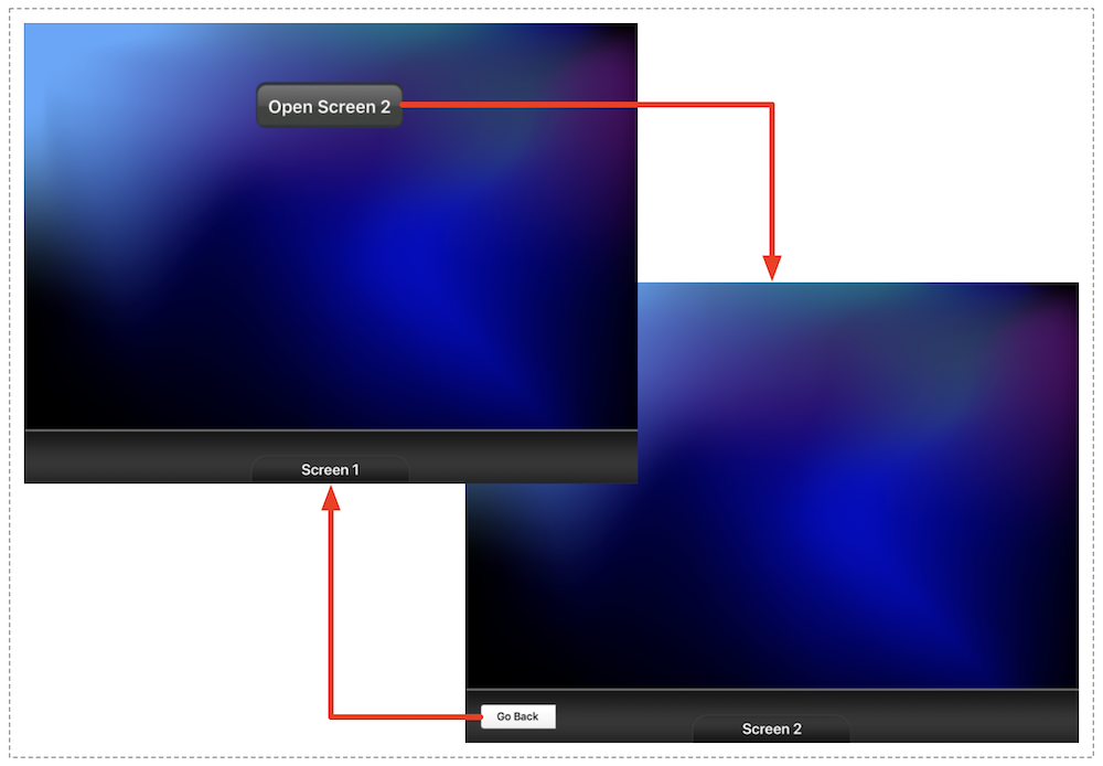
Notice how the navigation bar looks different on each screen. Using level 5 icons allow us to achieve this behavior. A closer look at Screen #2 will help to understand how this was achieved.
An alternate version of screen #2 is displayed below without the overlay. Both the label and button along the bottom are actually icons on this screen and not part of the overlay. By setting them to stacking level 5, they appear above the navigation bar contained in the overlay.